The first time I designed my Twitter header, I thought I had it all figured out. After all, it’s just a cover photo. Soon, I realized the header didn’t fit even though I designed it to the standard 1500 x 500 pixels. The borders were chopped off. And my profile picture obstructed the left side of the header image.
I thought I’d let it be. Except, I realized how unprofessional that would look and decided to redesign. My Twitter header looks much better now. But, it still isn’t free from mistakes. Which begs the question – what makes the perfect Twitter header?
In this post, let’s see how you can design an awesome Twitter header, which reflects your brand’s key message and attracts followers as well. By the end of this piece, I’m hoping you’ll be armed with important information including the standard Twitter header size, what to include in your cover, and design pitfalls to avoid.
Ready to get the perfect Twitter header? Let’s get to it:
Twitter header size + format – the basics
Before we dig into the meat of the matter, it’s best we settle on important pointers such as the correct size for a Twitter header, acceptable file type, and the like.
According to Twitter, the dimensions for a Twitter header are 1500 x 500 pixels with a file size of 2 MB. However, what you need to know is that this doesn’t mean you’ve all this space to yourself. Twitter tends to crop the top and bottom of a header on the desktop.
Related Read: How Brands Boost Twitter Engagement With Humor
On a mobile screen, the Twitter header displays in full. This means you need to design a cover image that doesn’t include any important design elements or text near the corners. In other words, your main message should be positioned in your Twitter banner size safe zone, which is 1500 x 360 px.
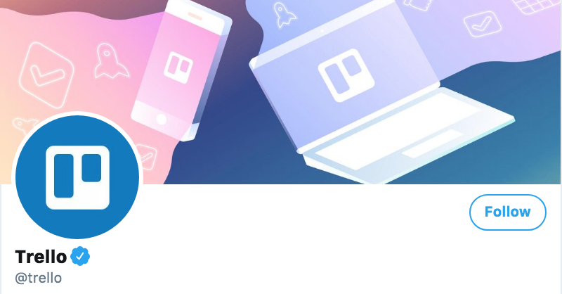
Next, you need to factor in your profile picture’s positioning – it’s something very easy to miss despite being so obvious. The profile image shows on the left side of a header so you need to be careful nothing important is present in that area.
When you choose to design using software like Adobe Illustrator, you’ll have to be mindful of these dimensions. Don’t forget the space your profile picture will take either. If you prefer a design tool though, you’ll get templates customized to fit a Twitter header’s size. For instance, Visme, an all-in-one design tool that helps design Twitter headers, infographics, and presentations among other things, gives you pre-sized templates such as below:
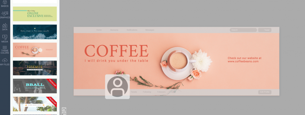
See that the grey-shaded areas show which parts will be chopped off (the borders) and where your profile picture is positioned, helping you ensure no important design elements get into these occupied areas. If you don’t prefer templates, you can opt for the blank canvas which also comes with its grey areas to guide your design.
Save your designs in PNG or JPEG format as these are what Twitter accepts. It accepts GIF format too. However, at this point, Twitter headers don’t support playing GIFs or any other animation or video (as in the case of Facebook cover photos).
When choosing your Twitter banner/header, you also need to remember it’s a horizontal space so a landscape-oriented image looks much better than a portrait or vertical photo.
Why do you need a good Twitter header?
Your Twitter banner/header shows up in one of these two circumstances:
- When someone visits your profile
- When someone clicks to see its summary
Frankly, only you can tell how many times followers will see your header as it depends on how active you’re on the network. For instance, if you host a Twitter chat, your audience is more likely to visit your profile and, therefore, see your header several times.
Good Tweets interest Twitterattis. If your tweets are interesting, say you have a humorous brand voice like Innocent Drinks has, people are more likely to be intrigued and check you out. See what happened, there? More views on your Twitter banner/header.
Lesson learned? You can’t ignore your Twitter banner. It’s a good place to personalize your profile and further your branding. In fact, it’s one of the first things that capture people’s attention when they visit your profile, so you really can’t afford to go wrong here.
Here’s an example:
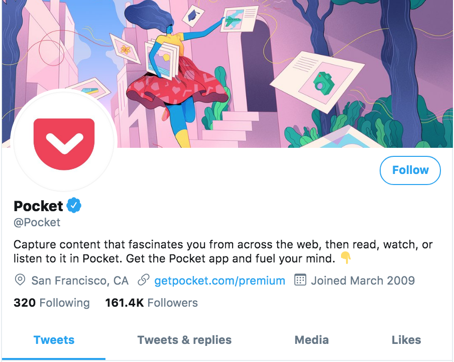
Considering our brains are a sucker for visual imagery, our eyes naturally go to the big, prominent header as we visit Pocket’s Twitter profile. It’s Twitter banner/header (and logo) is what sets it apart from other profiles in the first instance.
Notice what Pocket’s Twitter header is doing here:
- Hooking our attention. I’m thinking, “wow, that’s pretty”
- Showing Pocket’s personality. We can tell the brand has a light-hearted personality
- Shows what Pocket does
This last point is, particularly, important. A Twitter banner/header is a great place to showcase what your product does. Pocket’s cover banner tells a story. The character is tucking away files that are otherwise unorganized. If you read Pocket’s bio now, it’ll make sense what the app does – it saves your content in one place.
Apart from storytelling, there are a lot of creative ways to use a Twitter banner/header. Let’s look at the next.
Creative ways to use your Twitter header/banner
Use your Twitter banner/header to show what you stand for or convey your key brand message. Here’s a roundup of the creative ways to use your header:
- Deliver your key brand message – instantly
Visuals are a great way to communicate your brand message. They can immediately tell viewers what you do. And a prominent visual such as the Twitter banner works wonders in showcasing your message.
- Show how you help people
You can also use your header to show the impact your work has on your customers’ lives. Or, give an insider look into your team like British airways do:

- Use your header as a means to establish brand consistency across social channels
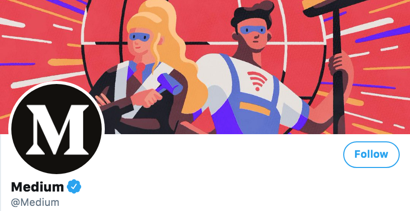
Cover photos are an excellent way to deliver a consistent brand message. The same branding elements across various social networks make your brand recognizable. Take Medium as a case in point here. Their Facebook cover and Twitter banner/header show design consistency:

- Change your header regularly to share business updates
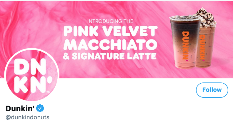
Lastly, you can also update your Twitter cover to update your audience. For instance, Dunkin Donuts has updated its header to talk about its latest product:
Twitter header examples
Looking for some inspiration before you design your header? Here are some of the best Twitter header examples I’ve come across.
1. Starbucks – the picture does the talking

If you sell a product, it’s never a bad idea to showcase it.
Also Read: What Is The Best Time To Post On Twitter in 2022
2. Pinterest – the graphic walks the talk
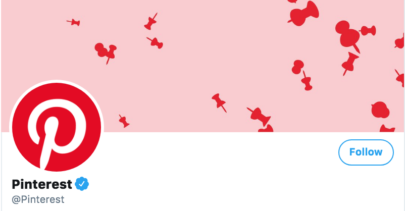
Pinterest does an aesthetically pleasing job at conveying what it does with the help of pins. And the best part – it chose to be unique with the graphic element in its cover image.
3. Animoto – minimalism takes home the trophy

Animoto doesn’t overdo the design in its header. Instead, it keeps it simple with a tagline that delivers a clear brand message.
4. KFC – clean design wins hearts

KFC’s header is stunning from the way it pairs simplicity with its brand colors.
Also Read:4 Effective Ways Solopreneurs and Freelancers Can Use Twitter to Their Advantage
5. Asana – tells what it does
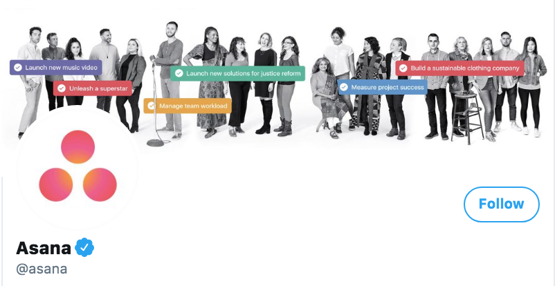
Asana’s Twitter header instantly tells what it does and shows its team as well. So there’s that.
Each of these examples leaves us with a good takeaway for designing a Twitter header. In the next section, we’ll outline these lessons. On we go.
Twitter header design tips
Design is tricky. One wrong move and all your hard work go down the drain. So how do you ensure your Twitter header is eye-catchy? Keep the following tips in mind:
- Stick with a clean, minimalist design
The clutter-free design makes your Twitter header visually designing. Viewers aren’t instantly blasted with a lot of information, which makes your header easy to understand and memorable.
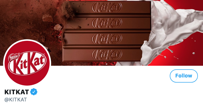
- Use a tagline or get rid of the text altogether
Adding text to your Twitter header is a gamble because the text size has to be readable. If not, you’re killing the very purpose of a header, which is to instantly tell viewers what you’re all about.
So you’ve two choices moving forward. One, get rid of all the text like KitKat does:
Two, only add your tagline like Maersk does:

If you choose to add your tagline, make sure you pick a readable font size. To this end, test your font’s eligibility on various screens before finalizing your header.
- Position any important elements in the centre
Like we’ve already discussed, a Twitter header’s corners are cropped on a desktop and your profile picture sits at the left-hand side. In other words, these areas aren’t design-safe. What’s safe, however, is the centre, which is why it makes sense to include any important elements of your design in the centre of Twitter banner.
Here’s an example:

- Experiment with asymmetrical design
Since your profile image sits on the left side of the header, you can experiment with an asymmetrical design. The asymmetrical design doesn’t worry about symmetry or equality between two sides as you can see below:
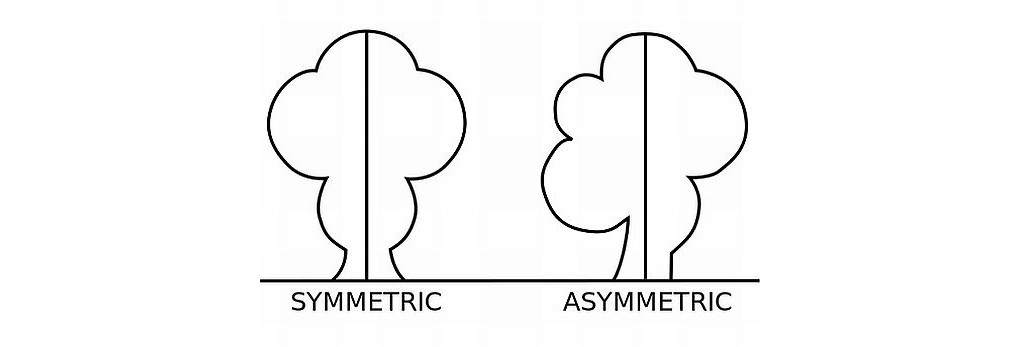
A case in point here is Basecamp. Their Twitter banner/header plays with its symmetry by positioning their tagline on the right-hand side:

- Only use high-quality images
Since a Twitter banner/header is the first thing that grabs a profile visitor’s attention, its quality is VERY important. You wouldn’t want to appear unprofessional by using a low-quality image on your cover. If you’re not a designer, you can still be creative by drawing inspiration from things like these beautifully designed templates for postcards that provide a design shortcut that can easily be adapted to suit your Twitter header.
- Be mindful of your branding
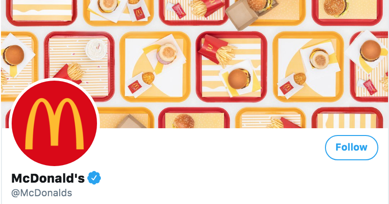
Lastly, make sure your header aligns with your brand. Don’t pick a header font that isn’t part of your branding. Make sure the colours you use also align with your branding. Another very important point – ensure colours in your Twitter headers go with your profile image.
McDonald’s Twitter header is an excellent example of a header that complements its brand colours:
Twitter header design pitfalls
Save yourself from the following:
- Cluttering your design, which makes it unpleasant to see and difficult to understand
- Forgetting about your header’s design safe zone and adding important design elements including text near the borders or under your profile image
- Overdoing it with text and missing out on its eligibility so header text isn’t easy to read
- Using stock photos that although good in quality are widely used, therefore, nothing unique
- Missing on using contrasting colours so your banner goes with your profile picture
- Failing to keep your branding consistent across social channels
How to design a Twitter header/Banner?
Alright, so you know what to add to your Twitter banner/header, design tips to stick by, and mistakes to avoid. Let’s get to the design part now. Follow these 3 simple steps to designing an awesome Twitter header:
1. Decide what you want
Before anything, plan. What do you want your Twitter header to look like? Should it tell a story? Or should it showcase your product? If you’re a service-based business, ask yourself: do you want your header to show you in action or you’d want to add your tagline only?
Once you’ve your objectives clear, you can get down to designing. Remember, your Twitter banner/header needs to be visually stunning and understandable. And, a representative of your brand personality.
2. Create a wireframe
It sounds complicated, doesn’t it? But it really isn’t. You only need to prepare a rough sketch of what you want your Twitter header to look like. Such a wireframe is essential for guiding you throughout the design part. It also speeds up the process because you know exactly what you want.
3. Design and test
I’ve already mentioned you can choose between Adobe Illustrator and a design tool. The only catch is – not everyone knows how to use Illustrator. In contrast, design tools are easy to use for almost everyone including non-designers (????).
Once done, test your header design. It’s better to test how your header looks before you close your design tools than to notice something wrong later on. Check how it looks on different screens. Is the text easily readable from the desktop as well as portable devices? Is your design well within the safe zone design space? Tweak your cover according to your test results. And, you’re all set.
Ready to design an awesome Twitter header?
Hopefully, this piece answered any questions you had in mind related to designing a Twitter header/banner and gave you some tips too!
If you still have any unanswered questions, drop us a comment below and we’ll get back to you.
Also Read: Twitter Marketing Strategy: How I’ve Grown My Twitter Account
